The color of a room has the power to change how you feel. A room color can make you feel calm, or energized, or even invoke anxiety.
Research spanning from 1895 to 2022 shows that humans systematically and reliably associate colors with emotions, such as yellow with joy, black with sadness, and light colors with positive emotions while dark colors evoke negative emotions. Your nervous system is responding to these visual cues whether you realize it or not!
We’ve been helping homeowners in southeastern Pennsylvania and New Jersey transform their spaces for years, and we can tell you that choosing the right paint colors isn’t just about aesthetics. It’s about creating an environment that supports how you want to live and feel every single day.
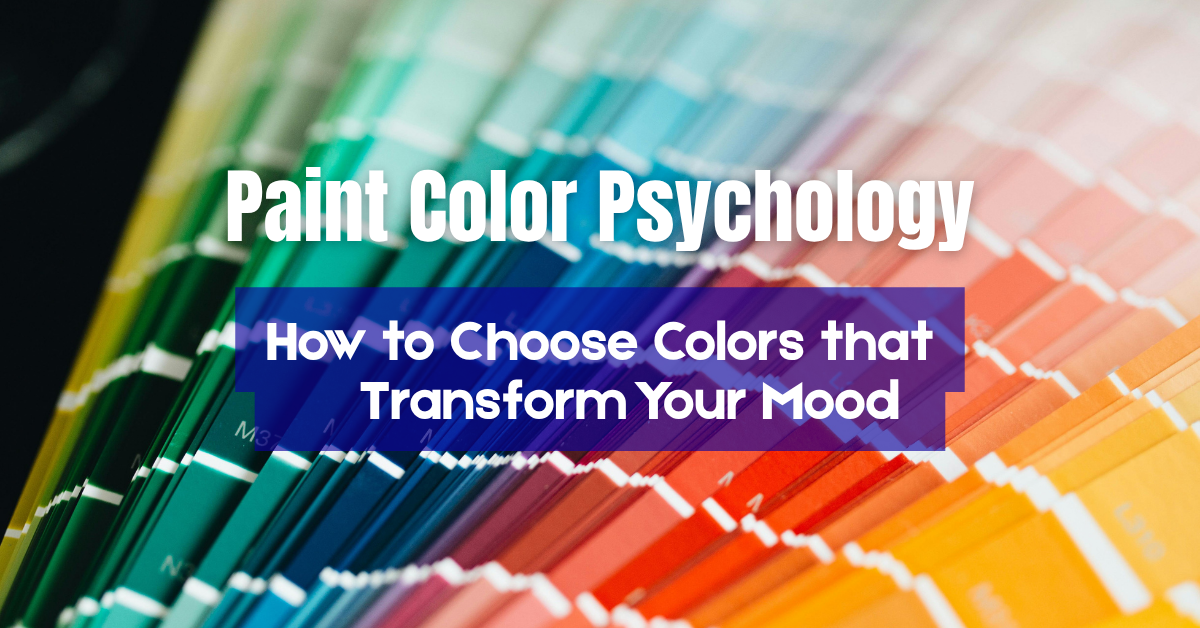
In this guide, we’re diving into the science and psychology of color, exploring how different hues affect your emotions, and giving you room-by-room guidance for creating a home that makes you feel incredible!

The Science Behind Color Psychology
This isn’t pseudoscience—it’s a well-documented phenomenon.
When light enters your eyes, different wavelengths of color are processed by your brain. Special receptors in your eyes feed information to your brain that affects how we perform and feel during the day. This biological response helps explain why certain colors influence sleep, focus, and mood so profoundly.
Other factors that play a role in our color responses include cultural context and personal associations. In general, warm colors typically make spaces feel more intimate, while cool colors create a sense of openness. This perceptual shift influences how we experience our living spaces and will influence what type of paint you choose for your home!
How Different Colors Affect Your Emotions and Behavior
Let’s break down the major color shades and explore how each one influences your mood and behavior. Research found systematic color-emotion correspondences driven by lightness, saturation, and hue, giving us a scientific framework for understanding these effects.
Red: Energy, Passion, and Stimulation
Red links to both positive and negative, arousing, and high-power emotions like love, anger, and passion. This makes red powerful for spaces where you want energy, excitement, and social interaction. Red also stimulates appetite—which is why so many restaurants use it—and can increase physical energy.
Best uses for red: Dining rooms (promotes conversation and appetite), accent walls in social spaces, front doors (welcoming and bold), workout spaces (energizing).
Orange: Warmth, Creativity, and Enthusiasm
Yellow and orange link to positive and high arousal emotions like happiness, pleasure, and fun. Orange combines red’s energy with yellow’s happiness, creating a warm, enthusiastic vibe. It’s less aggressive than red but still quite stimulating, encouraging creativity, social interaction, and optimism.
The challenge with orange is that it can be overwhelming in large doses. Burnt orange, terra cotta, and peachy tones are much more sophisticated than bright pumpkin orange and work better in modern interiors.
Best uses for orange: Creative spaces like home offices or craft rooms, kitchens (warm and inviting), playrooms (encourages creativity), accent walls (adds warmth without overwhelming).
Yellow: Happiness, Optimism, and Mental Clarity
Yellow and orange are associated with positive, high arousal emotions, making yellow the color of sunshine and happiness! Survey participants with yellow bedrooms came in at a close second for sleep duration at 7 hours and 40 minutes per night, showing that softer yellows can be quite calming.
Very bright or intense yellow can cause overstimulation. The key is choosing softer, warmer yellows rather than intense, bright ones.
Best uses for yellow: Kitchens (cheerful morning energy), home offices (mental stimulation), entryways (welcoming), breakfast nooks (morning optimism). Use soft, buttery yellows rather than intense shades.
Green: Balance, Renewal, and Calm
Green, blue, and blue-green link to positive and low arousal emotions like comfort, relaxation, and happiness. Green is nature’s color, and it’s one of the most universally calming hues. Green bedroom owners enjoyed 7 hours and 36 minutes of sleep each night and showed a higher tendency to wake up feeling upbeat and positive.
Sage and olive greens feel sophisticated and calming. Emerald and forest greens feel rich and grounding. Mint and seafoam greens feel fresh and clean. Green works in almost any room because it’s so naturally balanced.
Best uses for green: Bedrooms (restful and restorative), bathrooms (spa-like calm), home offices (balance and focus), living rooms (creates harmony). Green is incredibly versatile!
Blue: Calm, Focus, and Serenity
Blue, green, green-blue, and white are associated with positive, low arousal emotions. Blue is the most popular color for interior spaces, and for good reason. Blue is a calming color that’s especially receptive to special receptors in your retinas called ganglion cells, which send a message to your brain that you’re in a calm environment, lowering your heart rate and blood pressure.
Households with a blue color scheme in their bedroom get the best night’s sleep across the country, probably due to the fact that the color blue is associated with a feeling of calmness. Nearly 60% of blue bedroom owners reported waking up feeling happy on a regular basis.
Lighter blues feel airy, peaceful, and expansive. Navy and deeper blues feel sophisticated, grounding, and cozy. The main caution with blue is that very cold or gray-toned blues can feel depressing or sterile in rooms without much natural light.
Best uses for blue: Bedrooms (promotes better sleep), bathrooms (spa-like serenity), home offices (enhances focus), living rooms (creates calm social spaces). Blue is safe and versatile for almost any space.

Purple: Luxury, Creativity, and Spirituality
Purple is associated with empowering emotions, and historically it was linked with royalty and wealth because the dye was so expensive to produce. Purple combines blue’s calm with red’s energy, creating a color associated with luxury, creativity, and introspection.
However, at 5 hours and 56 minutes of sleep per night, purple is reported as the worst color for sleep because it’s a mentally stimulating color, boosting creativity and contributing to more vivid nightmares. This makes purple best used carefully and in small doses.
Lighter purples like lavender are much more calming and romantic than deep purples. Deep purples like eggplant and plum feel dramatic, luxurious, and sophisticated but can feel heavy if overused.
Best uses for purple: Bedrooms in lighter lavender shades (for romance and calm), creative spaces, reading nooks, accent walls in sophisticated spaces. Use carefully—a little goes a long way.
Neutral Colors: The Foundation of Modern Design
Now let’s talk about neutrals—whites, grays, beiges, and taupes. White links to positive and low arousal emotions like relaxation, hope, and relief, while black and grey link to negative emotions like fear, disappointment, and anger. This doesn’t mean you should avoid grays entirely—it means context and application matter!
White creates a sense of cleanliness, spaciousness, and simplicity. It reflects light beautifully and makes small spaces feel larger. However, stark white can feel cold or sterile. Warm whites with slight cream or beige undertones create welcoming spaces without feeling too bright.
Gray is the most popular neutral in modern design. It’s sophisticated, versatile, and pairs well with almost any accent color. Warm grays (with beige or taupe undertones) feel cozy and inviting. Cool grays (with blue undertones) feel more contemporary but can feel cold in rooms without good natural light. Survey respondents with gray bedrooms only slept 6 hours and 12 minutes per night, suggesting that grays should be chosen carefully for bedrooms.
Beige and Taupe have gotten a bad reputation as “builder beige,” but modern beiges are sophisticated, warm, and incredibly livable. They create cozy, comfortable spaces that feel timeless rather than trendy. Greige (gray-beige hybrids) offers the best of both worlds.
Black and Charcoal might seem bold, but when used thoughtfully, dark colors create dramatic, sophisticated spaces. Black is associated with negative, high arousal emotions, but in design contexts with excellent lighting and balanced with lighter elements, they make colors pop and create cozy intimacy.
The key with neutrals is understanding undertones. Every “neutral” has undertones—blue, green, pink, yellow, or purple. These undertones become visible when the paint is on your walls, and they need to coordinate with your lighting, flooring, and furnishings.
Popular Paint Color Trends for 2025
While psychology should drive your color choices more than trends, it’s helpful to know what’s current. Here’s what we’re seeing in southeastern Pennsylvania and New Jersey homes in 2025.
Warm, earthy neutrals are dominating. Think creamy whites, warm beiges, greiges with brown undertones, and soft taupes. People are moving away from the cool gray trend toward warmer, cozier neutrals that feel inviting and comfortable.
Nature-inspired greens are huge right now. Sage, olive, moss, forest green—these colors connect us to nature and create calming, grounded spaces. We’re seeing them everywhere from bedrooms to kitchens to living rooms.
Rich, sophisticated blues continue to be popular. Navy remains a favorite for cabinets and accent walls, while softer dusty blues and slate blues work beautifully for entire rooms.
Warm, muted earth tones like terracotta, rust, clay, and warm brown are appearing as accent colors. These add warmth and personality without being too bold.
Black and charcoal are being used more boldly—entire rooms, not just accent walls. When done right with excellent lighting, these create dramatic, sophisticated spaces.
The overall trend is toward colors that feel natural, warm, sophisticated, and calming. People are creating homes that feel like sanctuaries, especially after the stress of recent years.

Common Color Mistakes and How to Avoid Them
Let me share the mistakes I see constantly—and how to avoid them!
Mistake #1: Choosing colors without considering the whole room. You fall in love with a color on a chip, paint the walls, and then realize it clashes with your furniture, flooring, or fixed elements. Always consider the entire context.
Mistake #2: Going too trendy. That color might be Instagram-perfect today, but will you still love it in three years? Choose colors with longevity, especially for large investments.
Mistake #3: Ignoring lighting. Colors look completely different in different lighting. That “perfect gray” can look blue, purple, or green depending on your light. Always test in your specific space.
Mistake #4: Using the same white or neutral everywhere. Different rooms have different light and different purposes. Customize for each space.
Mistake #5: Painting everything one color. Open-concept living doesn’t mean monochromatic living! Creating subtle variation between spaces adds interest.
Mistake #6: Choosing too-intense colors for large surfaces. Choose more muted versions of colors you love for large applications.
Mistake #7: Forgetting about the ceiling and trim. Your walls are only part of the equation. Ceiling color affects how light or airy a room feels. Trim color creates contrast and architectural interest.
Mistake #8: Not testing properly. Those tiny paint chips lie! Sample pots exist for a reason. Paint large test swatches and live with them for several days before committing.
Mistake #9: Underestimating the power of finish. Flat, eggshell, satin, semi-gloss—the finish affects both appearance and durability. Choose appropriately for each space.
Mistake #10: Trying to do it all yourself without expertise. Color selection is genuinely difficult! There’s no shame in working with a professional color consultant or experienced painting contractor.
Working with Professional Painters: The Color Consultation Advantage
We’ve seen thousands of homes, worked with every lighting scenario, and know which colors actually work in real life versus on Pinterest.
When you work with professional painters, you’re not just paying for labor—you’re gaining access to expertise that can save you from expensive mistakes. We can help you understand how undertones will interact with your flooring, how your lighting will affect certain colors, and which finishes will work best for your lifestyle.
Many painting companies (including ours!) offer color consultation services. We’ll come to your home, assess your lighting and fixed elements, discuss your goals and preferences, and recommend colors that will actually work in your specific space. This service alone can save you thousands in regret repaints.
We also understand color flow throughout your home. We can help you create cohesion between rooms while still allowing each space to have personality. Your home should feel like a unified whole, not a collection of disconnected rooms.
Ready to Transform Your Home with Color?
Color is powerful! We’ve explored the science behind color psychology and broken down how different hues affect your emotions.
If you’re in southeastern Pennsylvania or New Jersey and ready to transform your home with colors that genuinely enhance your daily life, we’d love to help.
We offer comprehensive color consultations where we visit your home, assess your unique lighting and fixed elements, discuss your goals and preferences, and recommend a customized color palette that will work beautifully in your specific space. No generic Pinterest recommendations—expert guidance tailored to YOUR home and YOUR life.