

It’s time for new paint colors. Open all the windows, let the light in, and shake off whatever has felt heavy all winter… because spring is here!
The days are longer, the trees are budding, and we even saw some yellow flowers today.
That feeling of “spring refresh” and “spring cleaning” is real. It makes you want to overhaul your entire space… or maybe even move.
Before you do that, may I suggest, a new paint color?
This time of year, we see a lot of homeowners across Pennsylvania and New Jersey wanting to freshen things up without taking on a full renovation.
Here are a few that can make your space feel lighter, brighter, and a little more alive.
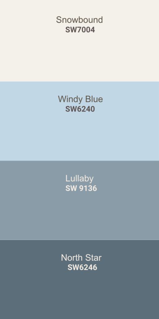
Warm, Soft Blue Paint Colors
Windy Blue (SW 6240)
Did you know blue can actually make a space feel calmer? It can help you relax and even sleep better so it is often used in bedrooms and nurseries.
This blue is great for spring. It’s soft and warm.
Light blues can feel icy if you don’t get the tone right. This one has enough warmth to keep it feeling cozy instead of sharp.
Bedrooms, bathrooms, sunrooms, offices — it works in a lot of spaces.
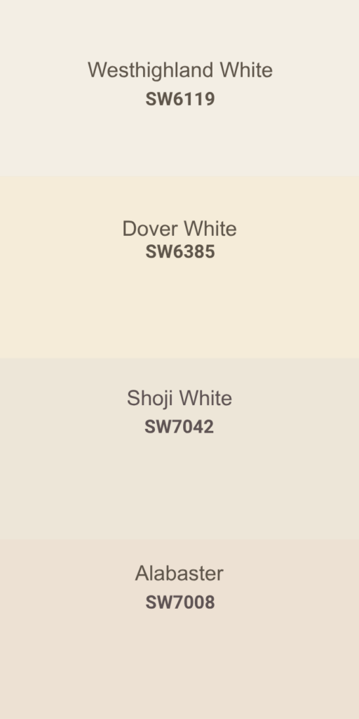
Springy White Paint Colors
Dover White (SW 6385)
White sounds easy… until you actually try to pick one.
Undertones and lighting can completely change how it looks.
Dover White is soft, warm, and light without going yellow. It brightens a space without making it feel sterile.
Walls, trim, cabinets — it works pretty much anywhere.
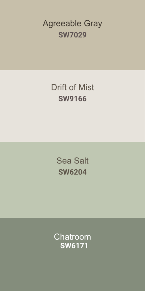
Warm Neutral Paint Colors
Drift of Mist (SW 9166)
If you don’t love white but you’re not ready for a stronger color, this is a good in-between.
It’s a very light gray-beige. It doesn’t take over the room, it just makes everything feel a little more put together.
Great for bedrooms, offices, or anywhere you want something calm without going full white.
Light Sage Green That Feels Like Spring
Sea Salt (SW 6204)
This one can change depending on the light.
Sometimes it looks green, sometimes a little blue, sometimes almost gray — so definitely test it in your space.
But it’s a beautiful color. It has that fresh, earthy feel without being too bold.
Bathrooms, bedrooms, kitchens — it works in all of them.
It would be really nice for a reading nook or office.
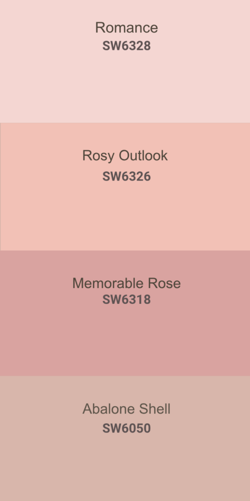
Soft Pink Paint Colors That Don’t Feel Too Pink
Rosy Outlook (SW 6326)
Pink can feel very… pink. Not everyone wants to live in a Legally Blonde set.
This one is soft, muted, and reads more like a warm neutral blush.
Bedrooms, powder rooms, even a master bath would be really pretty in this color.
A Few Things That Actually Help When Picking Colors
Paint looks completely different in your house than it does on a sample card.
Get a sample. Put it on your wall. Look at it in different lighting. It really does change everything!
North-facing rooms tend to feel cooler and darker, so warmer colors help.
South-facing rooms get more light, so cooler tones can balance things out.
Not Sure Which Color Would Actually Work in Your Home?
If you’re stuck between a few options or second guessing your choice, that’s usually where we come in.
We can walk through your space with you and help narrow it down so you don’t end up repainting in six months.
If You’re Ready to Change It Up
We help homeowners throughout Southeastern PA and The Jersey Shore with painting projects just like this.
If you want help choosing a color or getting it on the walls, reach out here. We’re happy to help you figure it out.
Happy spring!