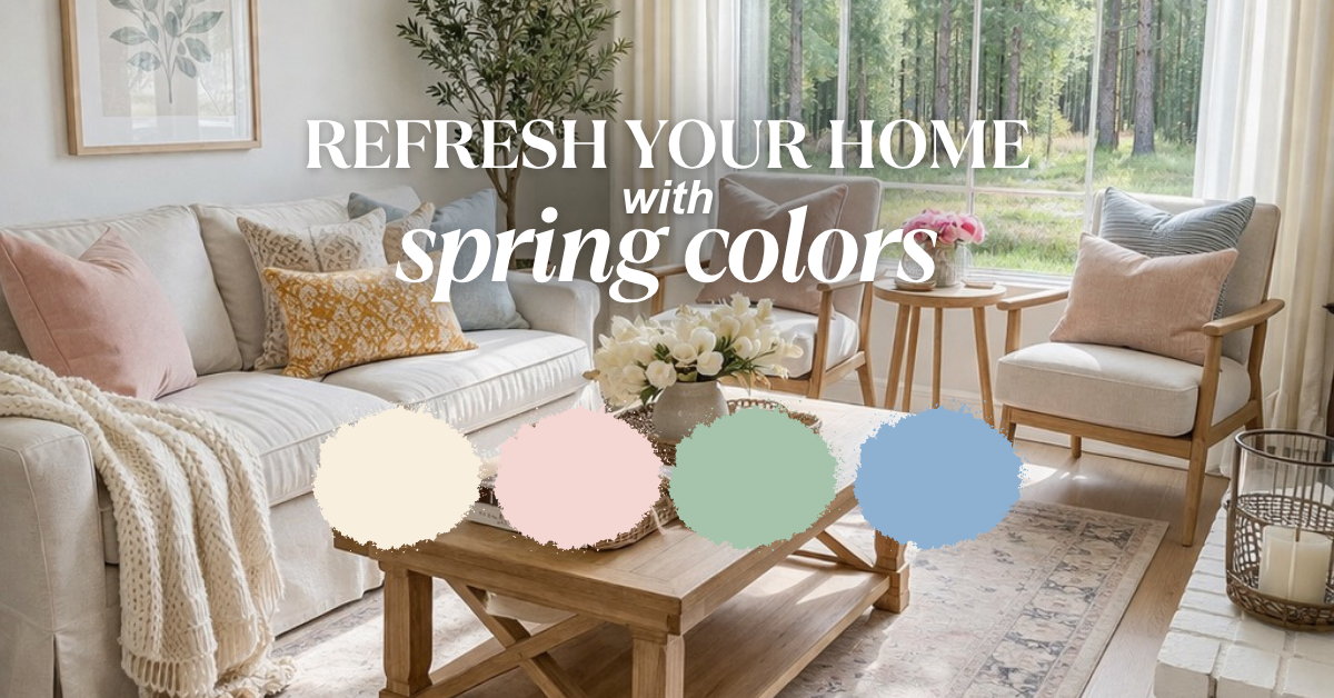
You found the perfect paint color at the store. The chip looked exactly right. But now it’s on your walls, and something is terribly off. That “warm gray” looks purple. The “soft white” is screaming yellow. The “greige” turned pink. What happened?
The answer is almost always undertones—those hidden color influences lurking beneath the surface that only reveal themselves once paint hits your walls. Understanding undertones is the secret to choosing paint colors with confidence and avoiding expensive do-overs.
For Pennsylvania and New Jersey homeowners investing in professional painting, knowing how undertones work prevents costly mistakes and ensures colors look exactly how you expect them to.
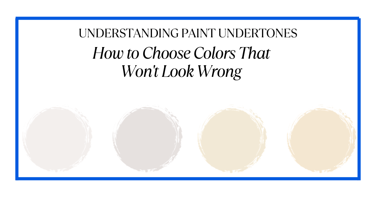
What Are Paint Undertones?
Every paint color has two components: mass tone and undertone. Mass tone is what you see immediately—the color that tells you it’s gray, beige, or white. Undertone is the hidden color beneath the surface that becomes apparent when paint interacts with your lighting, flooring, and surrounding colors.
Paint color undertones occur because, aside from the primary paint colors, every other color you can imagine is a mixture of different colors. That’s why there are thousands of variations of “white” or “gray”—each has different undertone combinations.
The closer the undertone is to the mass tone, the truer the color appears. A true red has red undertones. But magenta has blue undertones, while poppy has orange undertones—making them feel completely different despite all being “red.”
Common Undertones and What They Mean
Paint undertones typically fall into warm or cool categories:
Warm undertones include:
- Yellow
- Orange
- Red
- Pink

White Paint with Warm Undertones
Warm colors typically have undertones that are orange, yellow, or red.
Cool undertones include:
- Blue
- Green
- Purple
- Gray

White Paint with Cool Undertones
Cool colors have undertones that are green, blue, or purple.
Why Lighting Changes Everything About Undertones
The biggest factor affecting how undertones appear is lighting—both natural and artificial.
Natural Light and Room Orientation
Blue northern light will emphasize blue undertones; golden southern light will make colors appear creamier. This is why the same paint looks completely different depending on which direction your windows face.
North-facing rooms: Receive consistent but cool, flat light throughout the day. This blue-toned light emphasizes cool undertones and can make warm colors look muddy. These rooms often benefit from warm paint colors to balance the cool light.
South-facing rooms: Get warm, golden sunlight that makes colors appear softer and warmer. Cool paint colors work beautifully here because the warm light balances them.
East-facing rooms: Bright, neutral morning light that becomes flat and dull in the afternoon. These rooms need colors with enough saturation to prevent looking washed out during dull afternoon hours.
West-facing rooms: Flat and dull in morning but intensely warm in afternoon with that golden “easy-bake oven” effect. Like east-facing rooms, they need colors with personality

Artificial Lighting Impact
Colors will look totally different under yellow incandescent light versus green fluorescent light. Your light bulb choices dramatically affect how undertones appear.
Soft white/incandescent bulbs (2700K-3000K): Emit warm, yellow light that emphasizes warm undertones and makes cool colors appear warmer.
Bright white/cool LED bulbs (5500K+): Emit cool, blue-toned light that emphasizes cool undertones and can make warm colors look dull.
Daylight bulbs (4000K-5000K): Mimic natural daylight with neutral tone that reveals undertones most accurately.
If you’ve painted a room and hate the undertone that appears, try changing your light bulbs before repainting. Sometimes that simple switch makes all the difference.
How to Identify Undertones Before Painting
Professional designers and color experts use specific techniques to reveal hidden undertones before committing to paint.
The White Paper Test
Grab a white piece of paper and place your paint sample on top of it in bright natural light. This is especially effective for whites and light neutrals. The contrast against pure white makes undertones immediately visible—you’ll see if your “white” actually leans pink, yellow, blue, or gray.
The Comparison Method
If you’re just looking at a white by itself, it will probably just look white. But put it next to a pure white and you’ll see how it differs—the green or pink or blue undertone will show up in comparison.
Place your paint chip next to a pure version of that color. For grays, put it next to a true neutral gray. For beiges, compare to pure beige. The undertone reveals itself through contrast.
The Color Strip Technique
Look at darker colors on the same color strip as your chosen shade. Look at the mid-to-darker colors on a let-down strip—it will be much easier to identify the undertone than the paler colors at the top. The undertone that’s subtle in light shades becomes obvious in darker versions.
Check Manufacturer Classifications
Most major paint brands classify colors by undertone on their websites. Benjamin Moore, Sherwin-Williams, and Behr all provide this information, helping narrow down whether a color has warm or cool undertones.
Why Your Fixed Elements Matter
Undertones don’t exist in isolation—they interact with everything permanent in your room. Flooring, countertops, cabinets, tile, and brick all have undertones that must coordinate with your wall color.
Honey oak floors have strong orange-yellow undertones. Cool gray walls beside them will look purple or blue because the warm floor emphasizes cool undertones by contrast. You need warm greige or beige walls to harmonize.
Granite countertops with cool gray veining clash with warm beige walls—the beige suddenly looks yellow or pink. You need colors with similar undertones to create visual harmony.
If you try to compete with several undertones in the same space, you’ll end up with a mess on your hands. Trying to keep the undertones complimentary throughout the space will unify the space. This subtle coordination is what makes rooms feel cohesive even when you can’t pinpoint exactly why.
Testing Paint Colors Properly
Never choose paint from chips alone. Small samples under store lighting bear no resemblance to how colors appear in your actual space.
Proper testing process:
- Buy sample pots of your top 2-3 choices
- Paint large swatches (at least 2×3 feet) directly on your walls
- Test multiple walls in the room—undertones can look different on walls with different light exposure
- Observe at different times throughout the day and evening
- Check in various weather conditions—cloudy days versus sunny days
- View against your fixed elements—hold flooring samples, fabric swatches, and furniture against test swatches
- Live with samples for several days before deciding
This small investment in sample pots and time prevents expensive mistakes. Colors that look perfect at noon might look terrible at 8 PM under artificial light.
Common Undertone Mistakes Pennsylvania & New Jersey Homeowners Make
Choosing Cool Grays with Warm Flooring
This is the #1 undertone mistake in our region. Many Pennsylvania and New Jersey homes have warm wood flooring—oak, maple, hickory—with orange or yellow undertones. Homeowners choose trendy cool gray walls, then discover the gray looks purple, blue, or muddy because it clashes with warm floors.
Solution: Choose warm grays (greige) with slight beige or taupe undertones that harmonize with warm flooring.
Ignoring Brick and Stone Undertones
Many homes in our area feature brick fireplaces or stone accents with warm red or orange undertones. Cool paint colors clash violently with warm brick, making both look worse.
Solution: Coordinate wall color undertones with your permanent masonry. Warm neutrals or colors with slight warmth work best with brick and stone.
Not Accounting for Low Light Basements
Pennsylvania and New Jersey basements typically have limited natural light. Cool colors in low-light basements feel cold, dark, and depressing because there’s no natural warmth to balance them.
Solution: Choose warmer colors for basement spaces, or invest in warm-toned LED lighting to prevent cave-like feeling.
When to Use Warm vs. Cool Undertones
Choose warm undertones when:
- Your room faces north (cool natural light)
- You have cool LED or fluorescent lighting
- Your home has minimal natural light
- You want cozy, inviting atmosphere
- Your fixed elements (floors, counters) have warm undertones
Choose cool undertones when:
- Your room faces south (warm natural light)
- You have warm incandescent or soft white lighting
- Your home gets intense afternoon sun
- You want crisp, fresh atmosphere
- Your fixed elements have cool undertones
Professional Color Consultation Makes the Difference
Understanding undertones intellectually is different from applying that knowledge to your specific home. Professional painters and color consultants see how light interacts with colors daily and recognize undertones instantly.
At Davis Painting, we help Pennsylvania and New Jersey homeowners navigate undertone selection by assessing your lighting conditions, evaluating your fixed elements, testing colors in your actual space, and recommending colors that will look right in your specific environment.
We’ve seen every undertone disaster possible and know exactly how to prevent them. Our color consultation service includes in-home assessment, large-format sample testing, and expert guidance that saves you from expensive mistakes.
Schedule a color consultation with us for expert guidance!
What to Do If You’ve Already Made an Undertone Mistake
If your freshly painted walls reveal unwanted undertones, try these solutions before repainting:
Change your light bulbs: Switch from cool to warm LEDs or vice versa. This simple change can dramatically affect how undertones appear.
Add complementary colors: Bring in decor, textiles, and artwork with undertones that balance what’s on your walls.
Paint an accent wall: If one wall looks particularly bad, repaint just that wall in a coordinating color with better undertones.
Embrace it temporarily: Sometimes we adjust to colors over a few weeks. Live with it before committing to a full repaint.
If these solutions don’t work, repainting with a color that has the right undertones is the only real fix. It’s worth doing—living with paint colors you hate affects your mood and enjoyment of your home daily.
Ready to Choose Colors with Confidence?
Understanding undertones transforms paint selection from guesswork to informed decision-making. You’ll know why colors look different in stores versus your home, how to test properly, and what to look for in your specific space.
If you’re in southeastern Pennsylvania, New Jersey, or the Jersey Shore area and want professional help choosing paint colors that will look exactly right in your home, we’re here to help.
Contact Davis Painting today for a free color consultation. We’ll assess your lighting, evaluate your fixed elements, test colors properly, and recommend options with undertones that work beautifully in your specific space. No more paint color regrets—just colors you’ll love for years to come.