

White paint seems simple, but the truth is lighting, undertones, and even your home’s décor can make one shade look clean and bright — or cold and flat (think sterile hospital vs homey).
Here’s how to get it right.
Understand Undertones: Warm vs. Cool
Every shade leans either warm or cool, and that undertone changes how it feels in your space.
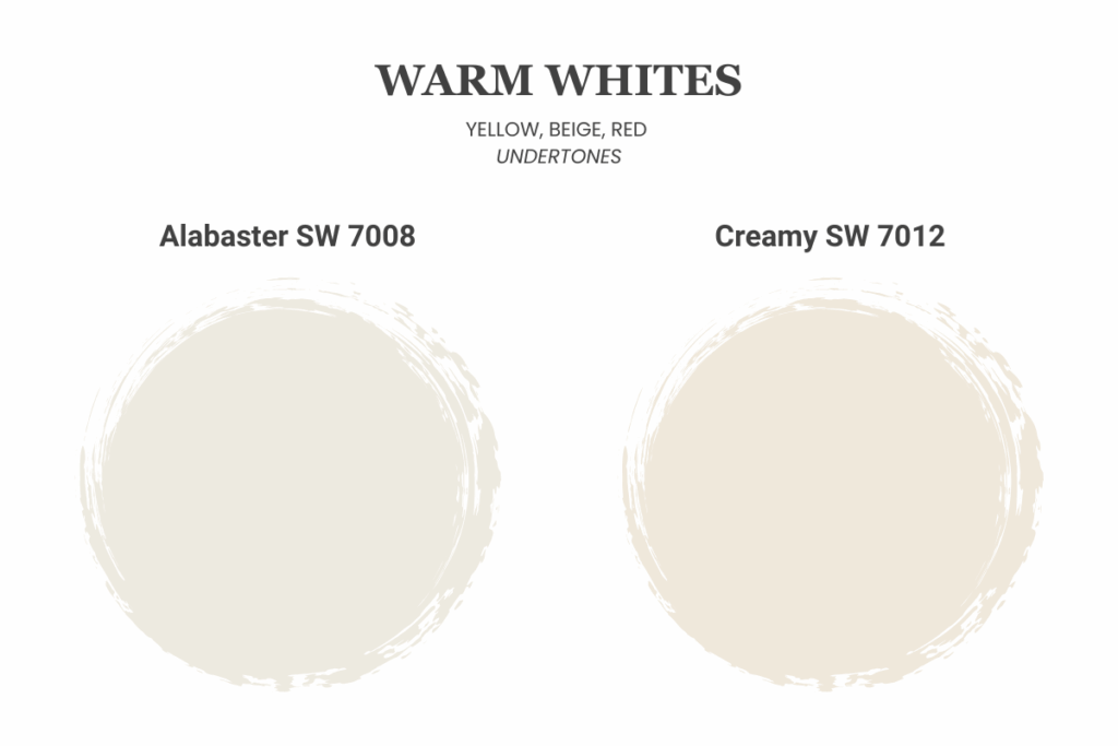
Warm whites (with yellow, beige, or red undertones) feel soft, cozy, and inviting.
They’re great for warm lighting and wood tones.
Sherwin-Williams Alabaster (SW 7008) or Creamy (SW 7012) will provide warmth.
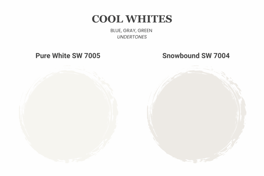
Cool whites (with blue, gray, or green undertones) look crisp and clean.
They’re perfect for modern spaces, cooler lighting, or rooms with lots of natural light.
Pure White (SW 7005) and Snowbound (SW 7004) are both examples of a cool white that will give a fresh, modern look.
Test in Real Lighting
White paint changes dramatically depending on lighting.
A color that looks warm and creamy in the store might look yellow under recessed bulbs — or gray in a north-facing room. We recommend testing paint swatches in your actual space before committing.
Look at the color in natural light during the day and again at night with your lights on.
Match It to Your Home’s Style
If your home has warm finishes such as wood floors, gold or brass fixtures, or beige upholster, go with a warm white to complement it.
If your home has cool finishes such as gray tile, chrome hardware, bright lighting, a cooler white will keep everything cohesive.
This balance helps everything flow together and keeps your walls from looking mismatched next to your décor.
Don’t Forget the Trim
You don’t have to use the same white for your walls and trim.
Using a crisper, cleaner white on your trim can help define your space and make the walls feel softer in contrast. For example, pairing Alabaster walls with Pure White trim creates subtle depth and dimension without clashing.
When in Doubt, Ask a Pro
White paint can be surprisingly tricky, but that’s what we’re here for.
At Davis Painting, we help homeowners pick the right shade for their lighting, décor, and style — so you get a white that looks perfect in your home, not just in a paint deck.