Davis Painting provides interior colors painting services across Pennsylvania for residential and commercial properties, including color consultation for homeowners planning a refresh.
Here is what every color trends list leaves out. Pennsylvania daylight from late October onward is short, low angled, and grey for weeks at a stretch. A color chosen under showroom lighting, or from a phone screen in July, can look like a completely different color on a north facing wall in November.
Choosing a cozy color here is less about what is trending and more about how the color behaves in the light your rooms actually get.
You may already know the feeling. A warm, inviting color on the chip. Painted on the wall. Now reading flat, or faintly grey, by four in the afternoon. That is not a failure of taste. It is light.
In this article:
Which cozy interior colors actually work in a Pennsylvania home in autumn and winter?
The colors that read as cozy in Pennsylvania autumn and winter light share one characteristic: a warm undertone that holds its warmth as daylight drops. Warm neutrals with a beige, greige, or soft clay base, muted earth tones such as terracotta and ochre, and deep saturated colors including forest and olive greens and warm charcoals all perform well in low light. Cool greys and stark whites, which look crisp in bright summer sun, tend to read flat through a Pennsylvania November.
Warm neutrals that do not go grey on you
The safest category, and the one most people get wrong.
Greige and soft clay toned neutrals hold their warmth as the light drops. The failure mode is a neutral with a cool or green undertone sophisticated in a showroom, cold and faintly dirty on a north facing wall in January.
The undertone decides this, not how light or dark the color is. Two neutrals of identical lightness can go opposite directions. This is the most common choice for bedrooms and the one worth testing most carefully.
Earth tones for rooms you actually sit in
Terracotta, ochre, warm sand, muted rust.
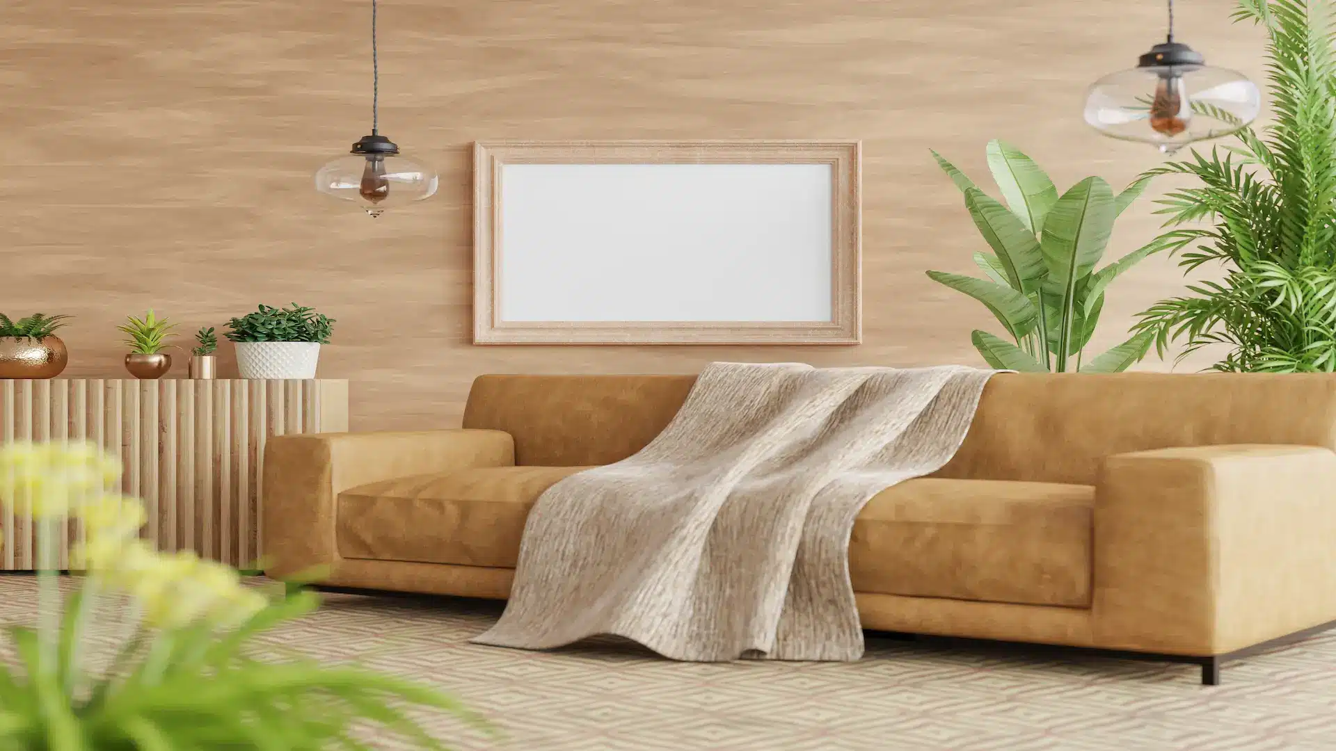
These carry real warmth and work particularly well in rooms used in the evening, because warm lamp light amplifies them rather than fighting them. Living rooms and dining rooms are where they earn their keep.
Deep saturated colors, which are less risky than people assume
Forest green, olive, warm charcoal, deep navy with a warm base.
Most homeowners assume a dark color makes a small room feel smaller. In practice, a saturated color in a room with limited natural light often reads as intentional and enveloping, where a pale color in the same room just reads as dim.
That is worth sitting with, because it runs against what most people believe about small rooms.
What tends not to work in Pennsylvania winter light
Cool greys, stark whites, and very pale blues look clean and bright under strong summer sun, and tend to go flat and slightly institutional under low grey winter light.
With one honest qualification: in a south facing room with genuinely good light, any of these can look beautiful. It is the light that decides, not the color.
Why does a color look different on your wall than it did on the chip?
A color looks different on your wall because of undertone and light direction. Every color carries an undertone, a secondary cast beneath the main color, and the direction a room faces amplifies or suppresses it. North facing rooms receive cool indirect light that pulls cool undertones forward and can make a warm beige read grey. South facing rooms receive warmer direct light that intensifies warmth. The same color can look like two different colors in two rooms of the same house.
What an undertone actually is
Every color has a secondary cast underneath it. Two beiges that look identical on a chip can have pink and green undertones respectively, and on a wall they will look nothing alike.
Quick test: hold the chip against a sheet of plain white paper. The white gives your eye a true reference point and the undertone becomes obvious immediately. It takes five seconds and it prevents most color mistakes.
Which way does the room face?
North facing rooms get cool, indirect, consistent light. It pulls cool undertones forward, so a warm color is usually the right correction.
South facing rooms get warm direct light that intensifies warmth, so cooler colors stay balanced there.
East facing rooms are warm in the morning and cool by afternoon. West facing rooms do the opposite.
Test on the wall, not on the chip
Paint a sample patch at least two feet square. Better still, two patches on different walls of the same room.
Then look at it three times: morning, mid afternoon, and after dark under the lamps you actually use.
A chip held against a wall is surrounded by the existing interior colors, which distorts how your eye reads it. A proper patch removes that problem entirely.
Your lamps matter as much as your windows
Underrated, and particularly relevant here. Pennsylvania rooms are lit artificially for much of the autumn and winter evening.
Warm bulbs amplify warm undertones and can push a neutral toward yellow. Cooler bulbs flatten warmth out. View your samples under the lighting you will actually be sitting in, because that is when you will see the room most.
When a color consultation is worth it
Worth it when several connected rooms need to work together, when previous attempts have not landed, or when the rooms have genuinely difficult light.
Probably not necessary for a single bedroom where you like a color and the room has decent light. Test it properly and trust yourself. The Painting and Decorating Contractors of America publishes guidance on interior colors and finish selection if you want to read further before deciding.
Test It on the Wall. Then Look Again at Four in the Afternoon.
The light in your rooms decides more than any trend list does, and a sample patch watched across a full day settles most color questions on its own.
If several rooms need to work together, or a previous choice has not landed, talk to Davis Painting about interior colors painting and color consultation anywhere in Pennsylvania.